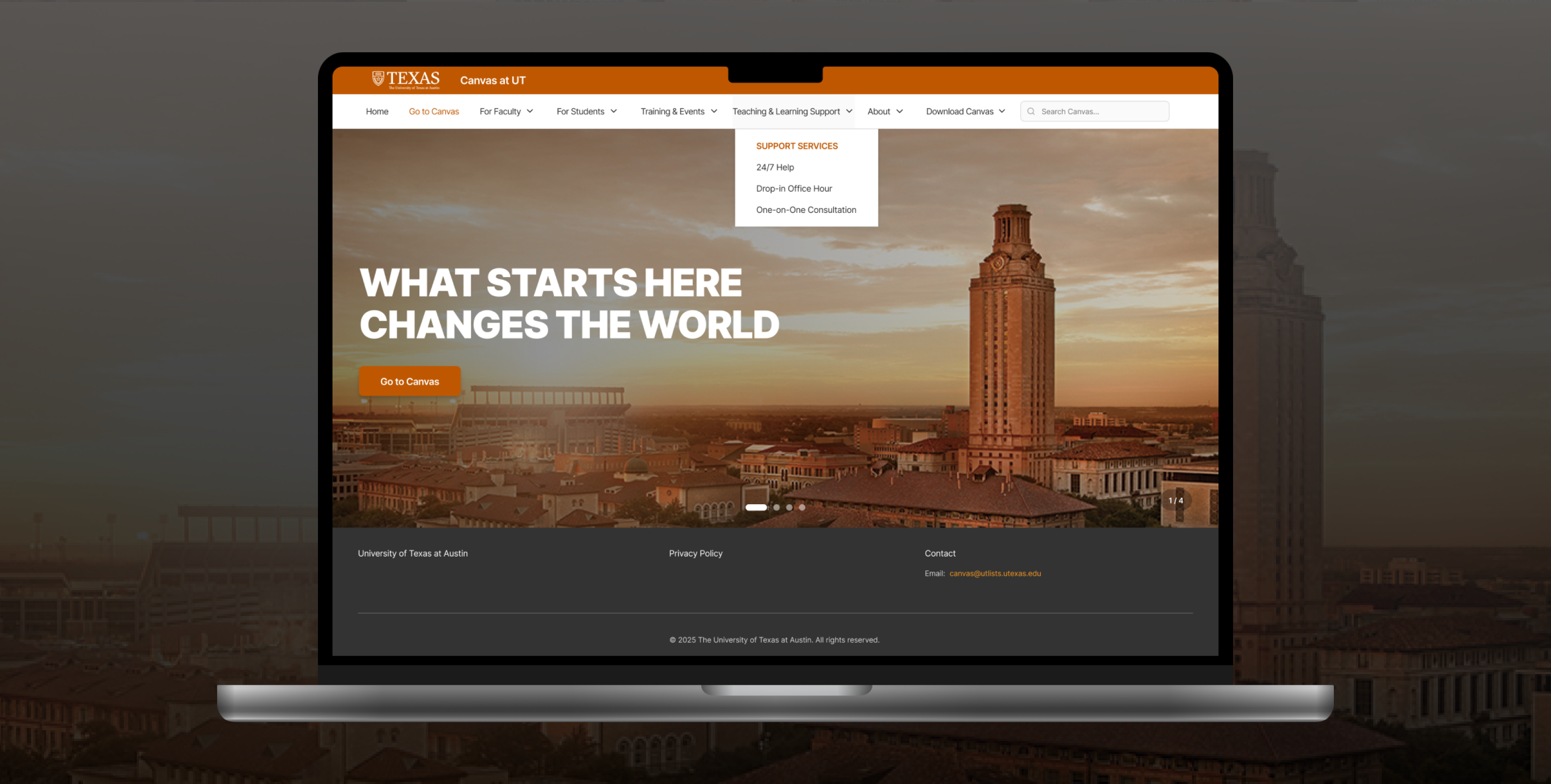
UT Canvas Resource Pages Redesign is an information architecture initiative focused on improving navigation clarity, content discoverability, and accessibility for faculty and students.
The UT Canvas Resource Pages support both faculty and students in managing teaching, learning tools, grading, accessibility, and course setup. However, the existing information architecture suffered from unclear labels, fragmented navigation, and accessibility inconsistencies, making it difficult for users to locate resources efficiently. Our team redesigned the information architecture to improve:
🔍 Findability
🧠 Mental model alignment
♿ Accessibility compliance
🧩 Structural consistency across pages
As a UX Designer on a student team, I contributed to:
– Conducted content inventory and audit to identify redundancy, gaps, and labeling issues.
– Led and synthesized card sorting studies to inform sitemap and navigation structure.
– Designed accessibility checklist and validation workflow
– Built design system components for hierarchy and spacing
Stakeholder Interviews: Understand workflows and pain points.
Content Inventory & Audit: Identify redundancy and labeling issues.
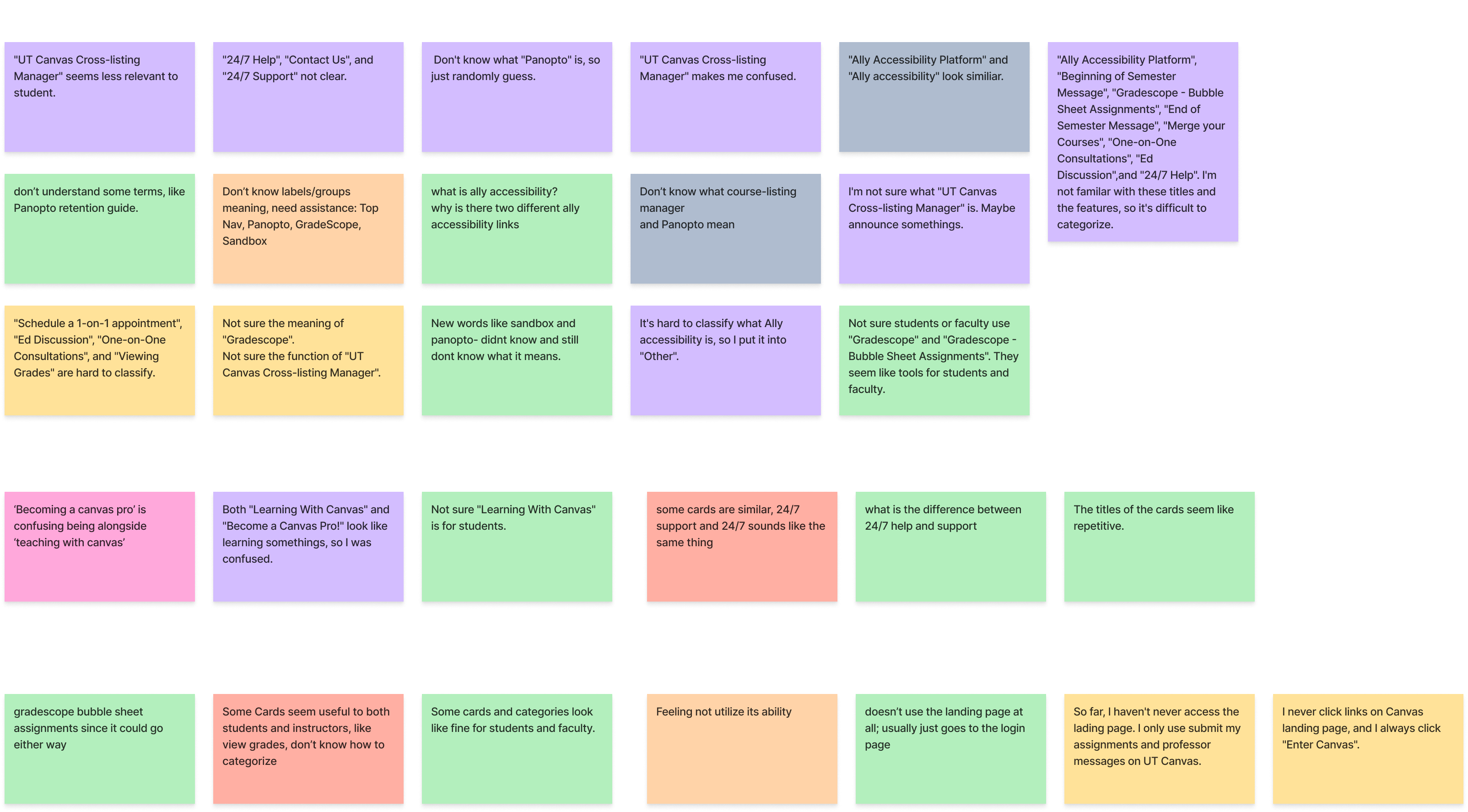
Card Sorting (Open + Closed):
– Validate mental models and category alignment.
– Two rounds were conducted: first to evaluate the existing structure, and second to validate the revised sitemap.
Accessibility Testing: Audit contrast, hierarchy, and screen-reader compatibility to guide inclusive design.
Quantitative & Qualitative Analysis: Analyze agreement patterns (similarity metrics) and behavioral feedback (think-aloud + observation) to surface ambiguous items.
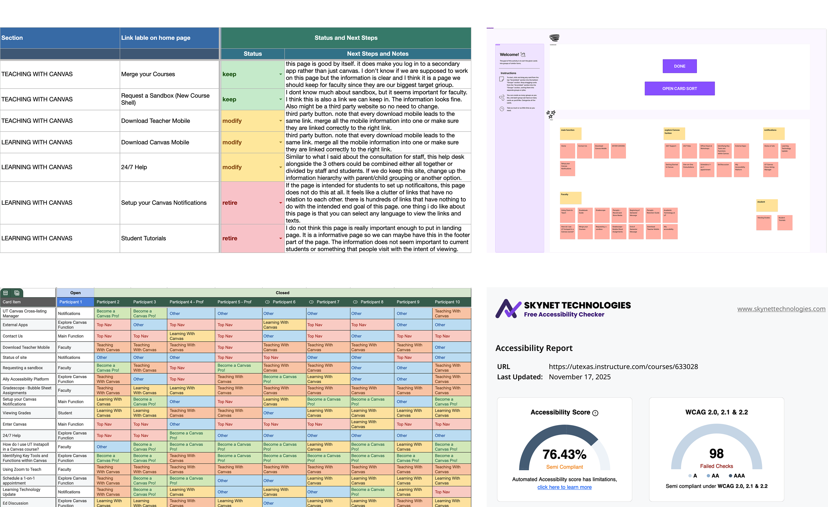
Through stakeholder interviews, content inventory audits, and card sorting exercises, we identified structural and labeling issues and synthesized patterns using affinity mapping.
– Unclear & jargon-heavy labels
– Redundant and overlapping categories
– Mixed audience ambiguity
– Visual hierarchy & accessibility gaps: Weak heading structure, Low contrast, Dense layouts impacting scan-ability and screen-reader performance
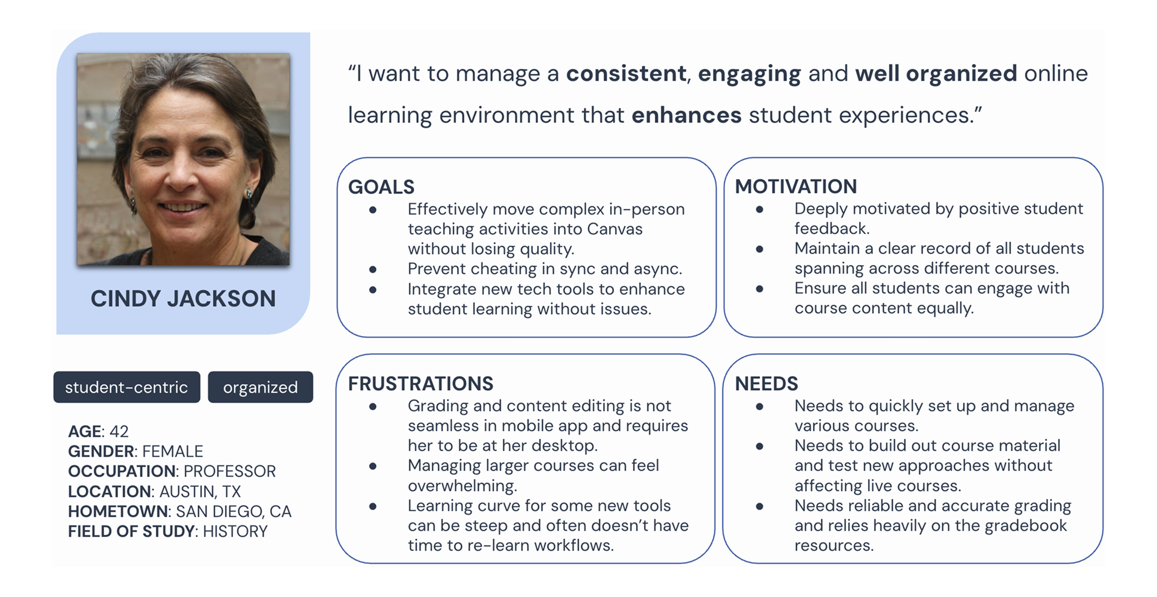
– Needs efficient course setup, grading reliability, and scalable workflows.
– Frustrated by steep learning curves and fragmented tools.
– Needs fast access to assignments, tools, and expectations.
– Frustrated by hidden content, broken links, and excessive navigation steps.
– Role-based navigation (Faculty vs Students)
– Simplified hierarchy
– Global navigation consistency
– Replaced jargon with plain-language labels
– Unified naming conventions: Verb + Objective pattern
– Added descriptive microcopy
– 23 refined labels out of 34 total labels
– Heading hierarchy
– Typography scale
– Color system with WCAG contrast compliance
– Spacing rules
– Icon usage standards
– Accessibility checklist
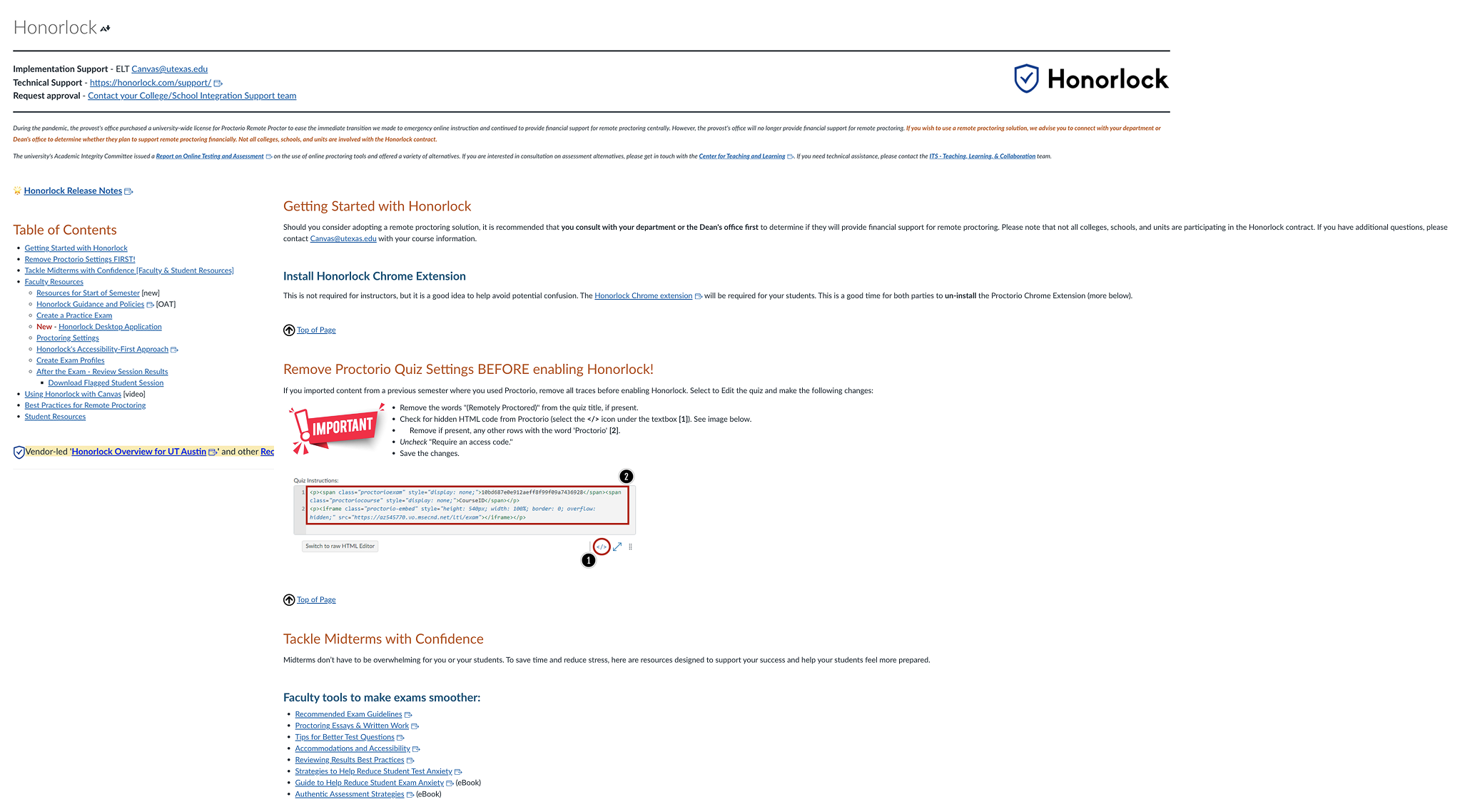
– Dense, text-heavy layout with poor scannability
– Critical steps buried within long paragraphs
– Mixed content types (instructions, policies, FAQs) without clear structure
– Inconsistent headings and limited visual hierarchy
– Accessibility issues (contrast and heading structure)
Based on research insights and design system guidelines, we reorganized the page around task-based flows, clearer hierarchy, and accessibility-first components:
– Structured setup as clear step-by-step tasks
– Replaced vague labels with action-oriented headings
– Added contextual guidance and descriptive subtitles
– Used callouts to surface critical requirements
– Applied consistent hierarchy and typography rules
– Improved contrast and accessibility compliance
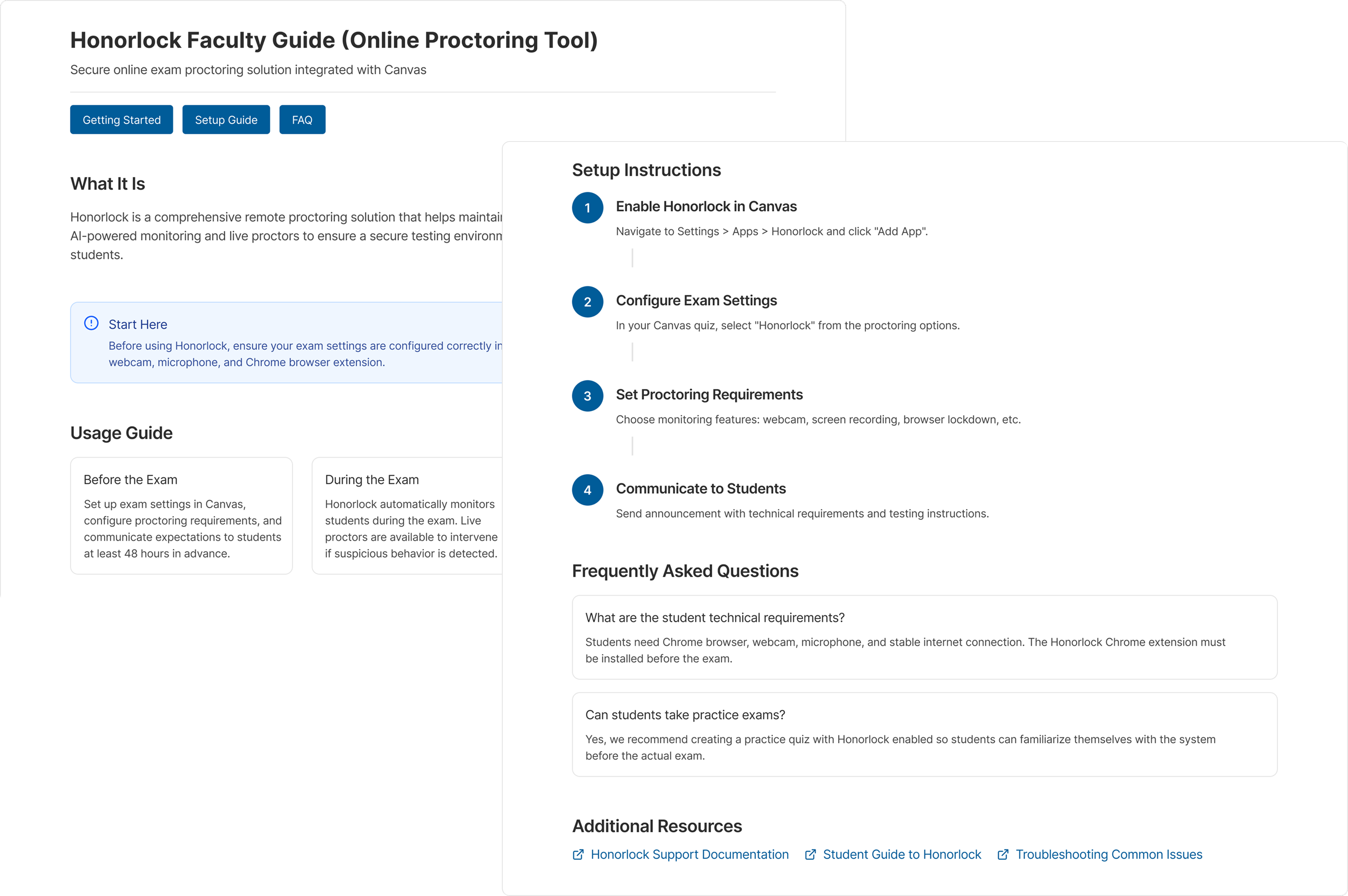
– Enables faster scanning and clearer task prioritization
– Reduces setup errors by guiding instructors step by step
– Improves accessibility for screen readers and low-vision users
– Creates a reusable layout pattern for other tool pages
🟠 How labeling impacts cognitive load and trust
🟠 Translating qualitative insights into structural decisions
🟠 Designing for accessibility at system level (not only UI)
🟠 Balancing institutional constraints with user mental models
🟠 Designing scalable frameworks instead of one-off pages