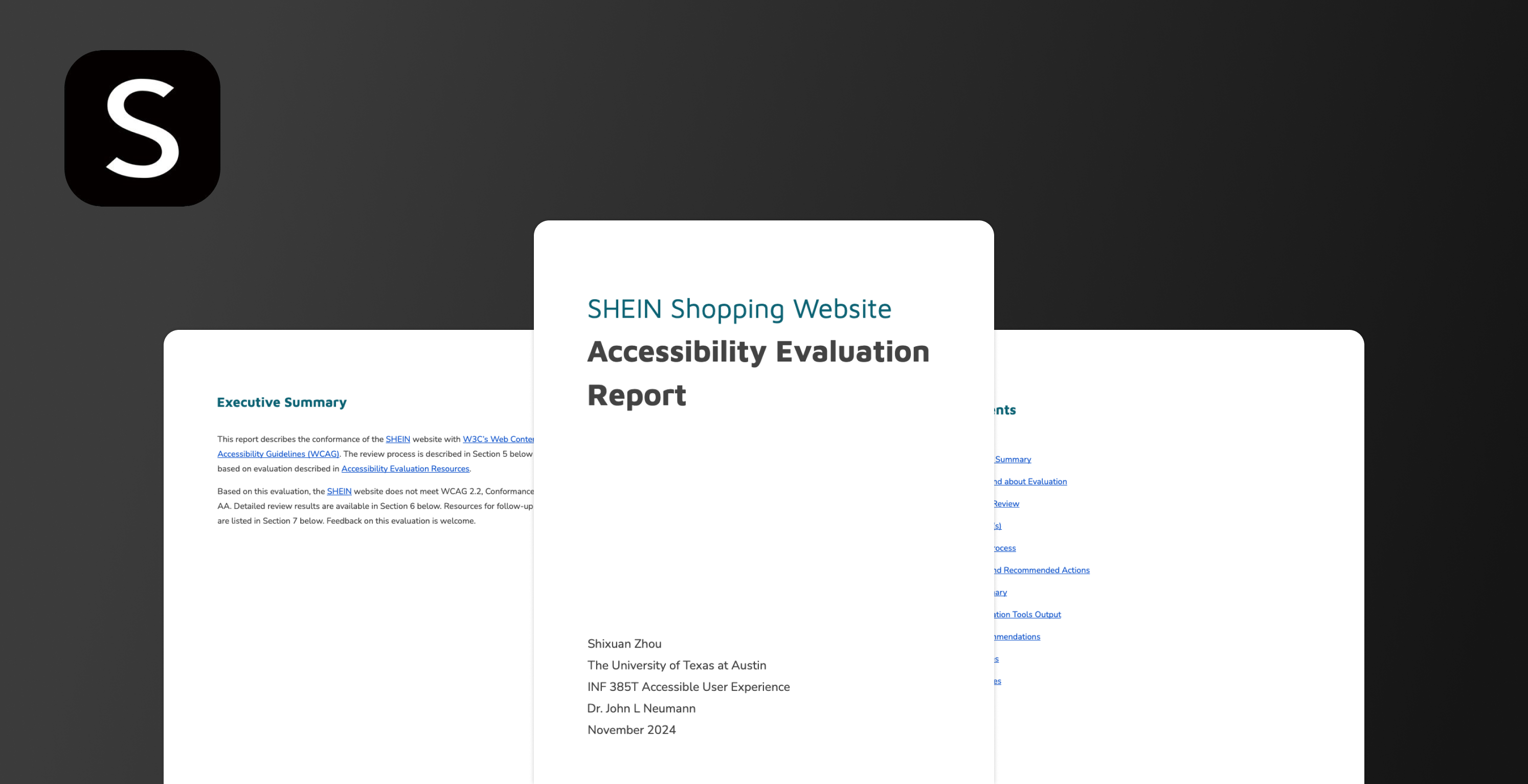
As part of my graduate coursework at UT Austin (INF 385T: Accessible User Experience), I conducted an 🧑🦯♿️🦻accessibility evaluation of the SHEIN online shopping website. The goal was to assess how well the site conforms to WCAG 2.2 (Level A & AA) standards and identify improvements that could enhance inclusivity for diverse users.
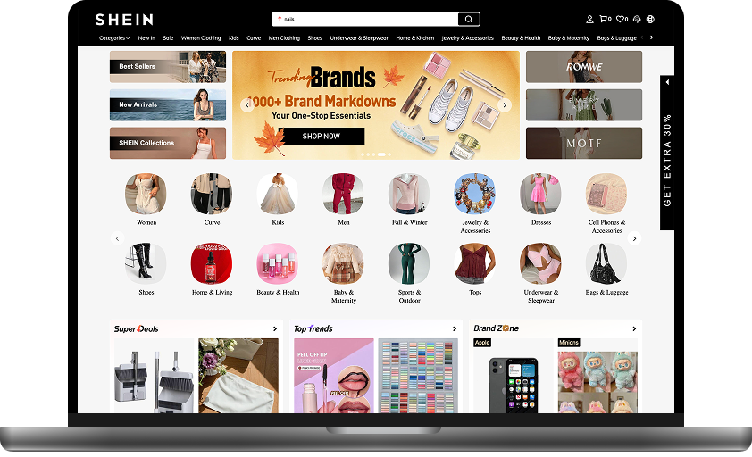
SHEIN is one of the world’s largest fast-fashion e-commerce platforms, serving millions of users across different countries. Its website provides affordable, trendy fashion and lifestyle products to a global audience. With such a broad and diverse user base, ensuring accessibility is critical. Despite its popularity and global reach, the SHEIN website shows significant accessibility gaps. These gaps create barriers for users who rely on assistive technologies or alternative interaction methods, such as:
Low contrast text and missing alt-texts make it difficult for screen reader users or people with low vision to navigate.
Inconsistent keyboard navigation and lack of focus indicators hinder users who cannot use a mouse.
Auto-advancing carousels and unclear page structures make it harder for users with cognitive or attention-related disabilities to stay oriented.
Passed
Failed
Cannot Tell
Not Presented
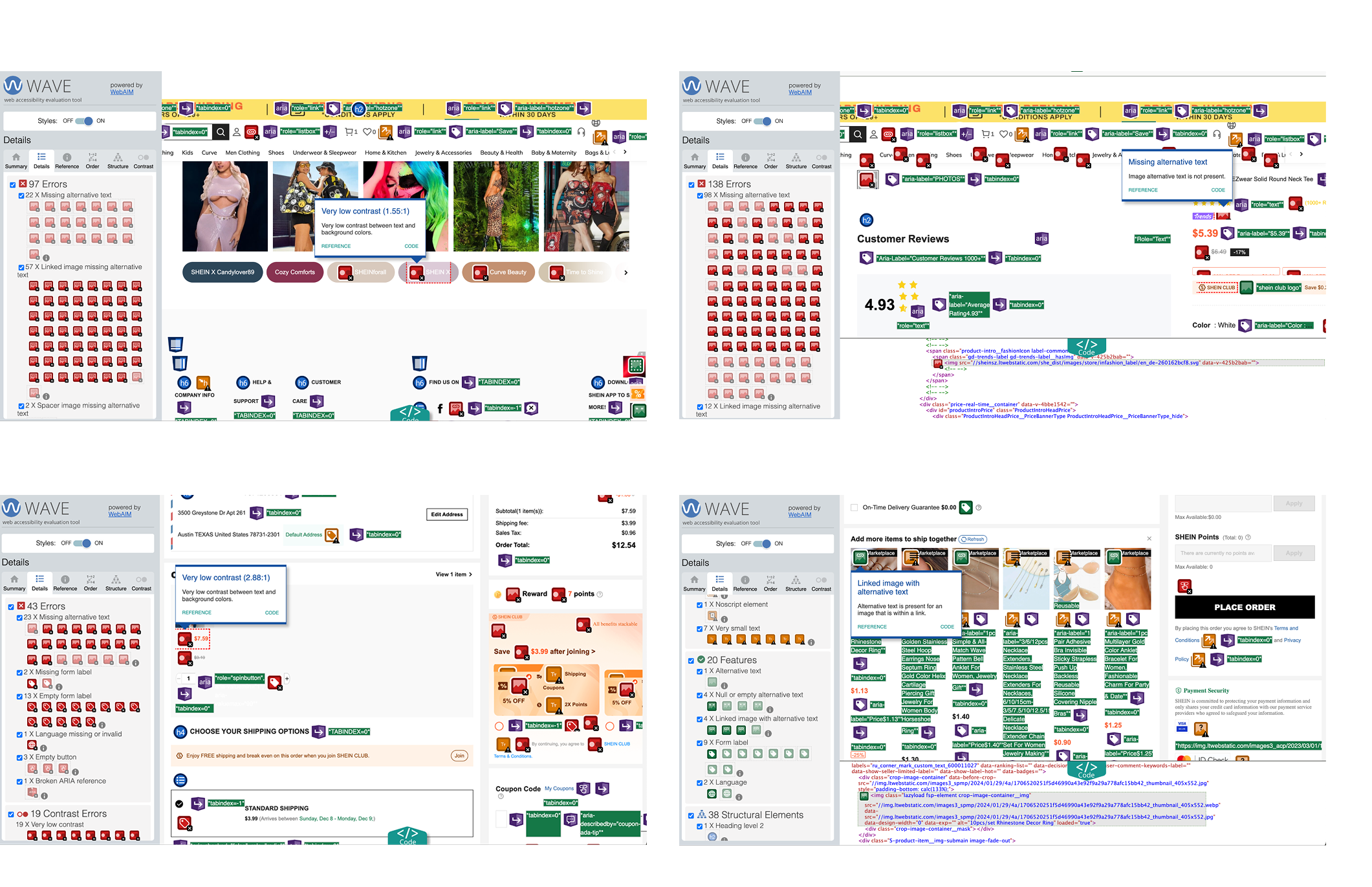
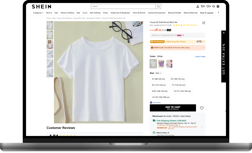
Low Contrast
Text and button labels often fall below the 4.5:1 ratio.
Example: Product details hard to read on light background.
Missing Alt-text
Product and checkout images lack descriptive alt attributes.
This blocks screen reader users from understanding content.
Keyboard Navigation Issues
Focus indicators are missing or unclear.
Navigation order is inconsistent, causing confusion for non-mouse users.
Uncontrollable Carousels
Auto-advancing banners cannot be paused/stopped.
Difficult for users with cognitive or motor impairments.
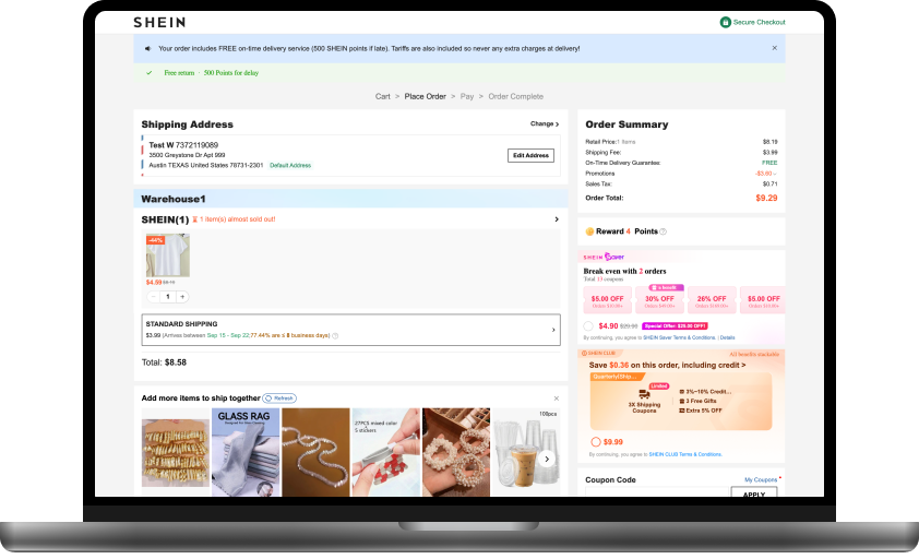
Predictable page behavior
Pages operate in consistent and expected ways.
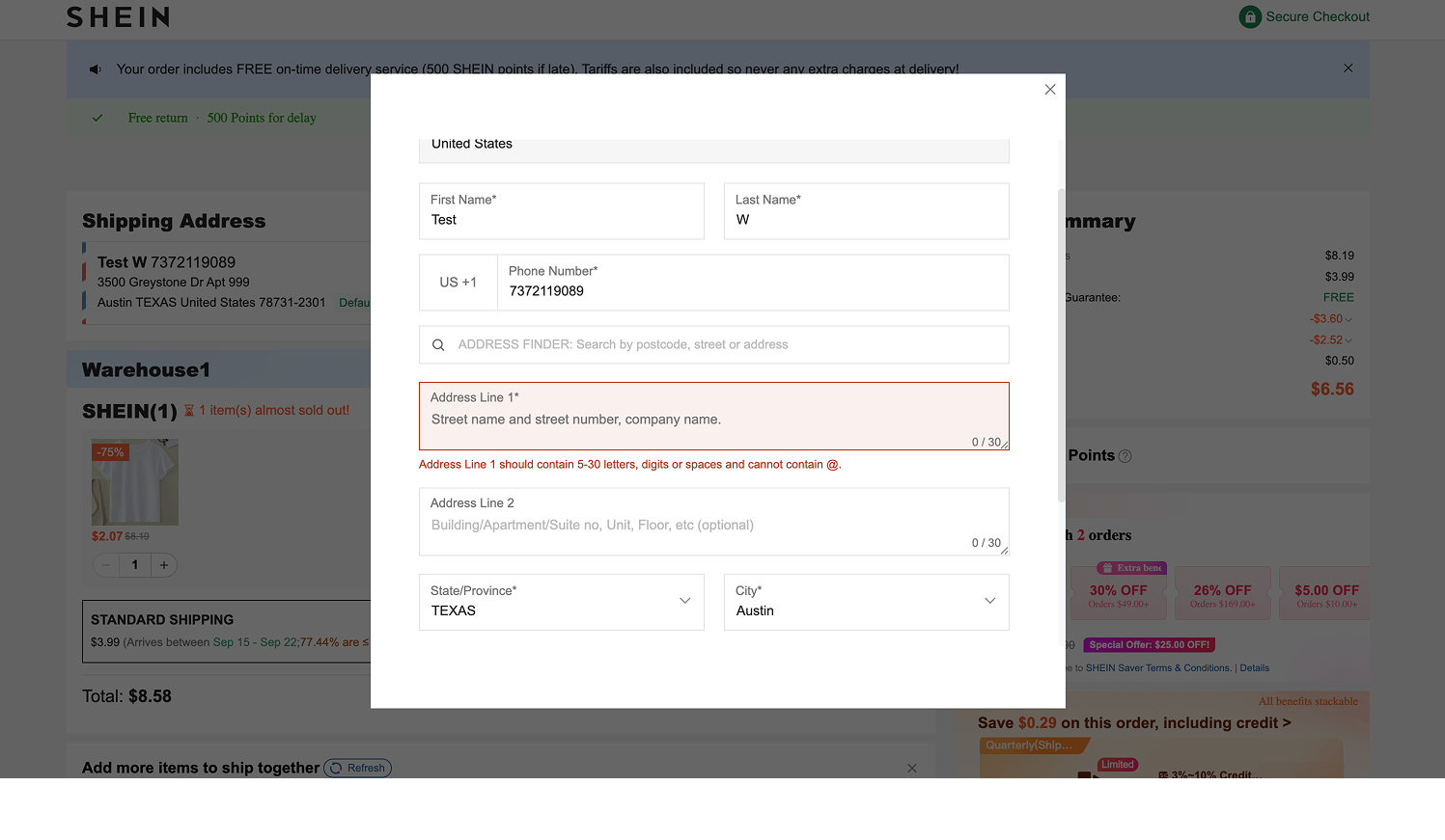
Input assistance on forms
Checkout detects errors and provides correction hints.
Ensure all images include meaningful alt-text for screen readers.
Adjust text and UI element contrast to meet WCAG 2.2 AA standards.
Add captions to all pre-recorded videos for better media accessibility.
Make focus indicators visible and optimize navigation order.
Use headings and titles consistently to improve information hierarchy.
Allow users to pause, stop, or restart auto-advancing carousels.
Use clear and accessible alerts (e.g., toast notifications) to keep users informed.
This evaluation deepened my understanding of accessibility challenges in large-scale e-commerce platforms. It highlighted how small design changes, like improving contrast or adding alt-text, can significantly improve inclusivity.
As a Product Designer, I view accessibility not only as compliance but as a core part of creating equitable user experiences.